Document.css indents
Where is the gap?
Styling text document is mostly about fonts and indents. Sounds pretty simple but this little complexity is enough for having problems. The main difficulty is that the indent specified by margin CSS property is the indent between text lines that already contain font-specific gaps. And those who will read the document will not be able to recognize this indent because there are no visual designation of line-height but what is recognizable is the indent between baseline of text above and meanline of text below.
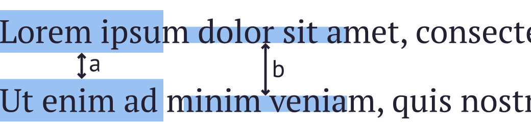
b) the indent that person can recognize
So I decided to indent the text by those visual lines in Document.css and for the same reason the better way of sizing the font is to specify the x-size, not the font-size.
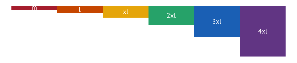
What is the grid?
Choosing the size of font or size of indent is always the torment especially for non-designer developers like me. Should this header be the size of 20px or 24px? It always hard to decide. Fortunately, same problem has been successfully solved for the tasks estimating in Agile — using Fibonacci sequence in estimates. Choosing between 21 and 34 is easier than choosing between 20 and 24. And to make things even easier, I decided to use not the Fibonacci sequence but golden ratio sequence. They are very similar but golden ratio makes every next value to be higher than the previous by the same ratio (x1.618) and it easier to calculate.
So both indent system and size grid are results in next picture:

Sizes composition
Golden ratio sequence as well as the Fibonacci sequence follows the rule that the next value is a sum of two previous. This allows to combine sizes in different ways.
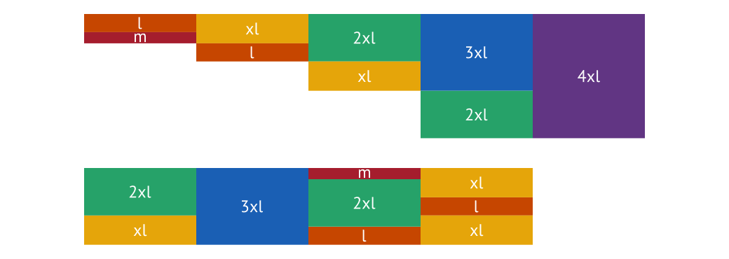
You can see the benefits of this combinations on the next picture. Breadcrumbs height and indents in sum are the same height as the indent between the top of the document and header. So no matter if there are breadcrumbs, document header is always in same place and in all cases all sizes and indents are follow common rules.

Testing
There is a way to check this indents that was used in development of that styles. If you add following code to HTML, draggable rulers will appear. You can drag them and check if indent is following the grid.
<div class="Document-Rulers">
  <div class="Document-Ruler Document-Ruler_4xl" draggable="true"></div>
  <div class="Document-Ruler Document-Ruler_3xl" draggable="true"></div>
  <div class="Document-Ruler Document-Ruler_2xl" draggable="true"></div>
  <div class="Document-Ruler Document-Ruler_xl" draggable="true"></div>
  <div class="Document-Ruler Document-Ruler_l" draggable="true"></div>
  <div class="Document-Ruler Document-Ruler_m" draggable="true"></div>
</div>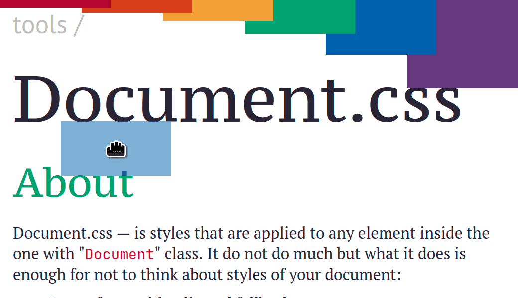
On this very page you can toggle rulers by clicking the button below. Unfortunately, do not work on touchscreens.